Rebuilding a business banking platform that had outgrown its interface
The situation
By 2024 the product had been shipping features for years on an interface that was never structured to hold them.
The symptoms were everywhere — cluttered tables, inconsistent placement, a dashboard nobody liked — but symptoms were not the problem worth solving.
Outcome
It shipped in two stages. First the platform: dashboard, accounts as their own section, payments, history, documents, recipients, teammates, analytics, settings, every details card and every flow, plus mobile web and redesigned skeleton screens. Then, separately, the reworked sign-up and onboarding flows. The iOS and Android apps followed in 2025.
What was actually wrong
I went looking for constraints rather than complaints, and found four that explained most of the surface damage.
The navigation had a ceiling. The number of visible menu items was limited by screen width, and below 1280 px it degraded badly. Every new section made it worse.The interface could not grow because the navigation could not grow.
The grid forbade small things. Dashboard widgets couldn't be narrow — the layout structure didn't allow it — so every widget was large and information-poor.We had a dashboard with low density and no room for anything new.
Placement followed leftover space. Calls to action, app links, average balance: these had been added after the fact, wherever room remained.Their position expressed the build order, not their importance.
Tables broke below desktop. On tablet widths content blurred together and the number of readable characters dropped to an unacceptable level.Below 1280 px the history table stopped being readable at all.
None of these could be fixed inside the existing frame.
That is what made it a redesign rather than a clean-up.
The decisions I'd defend
Each area had a long list of changes. These are the ones where the choice was genuinely difficult.
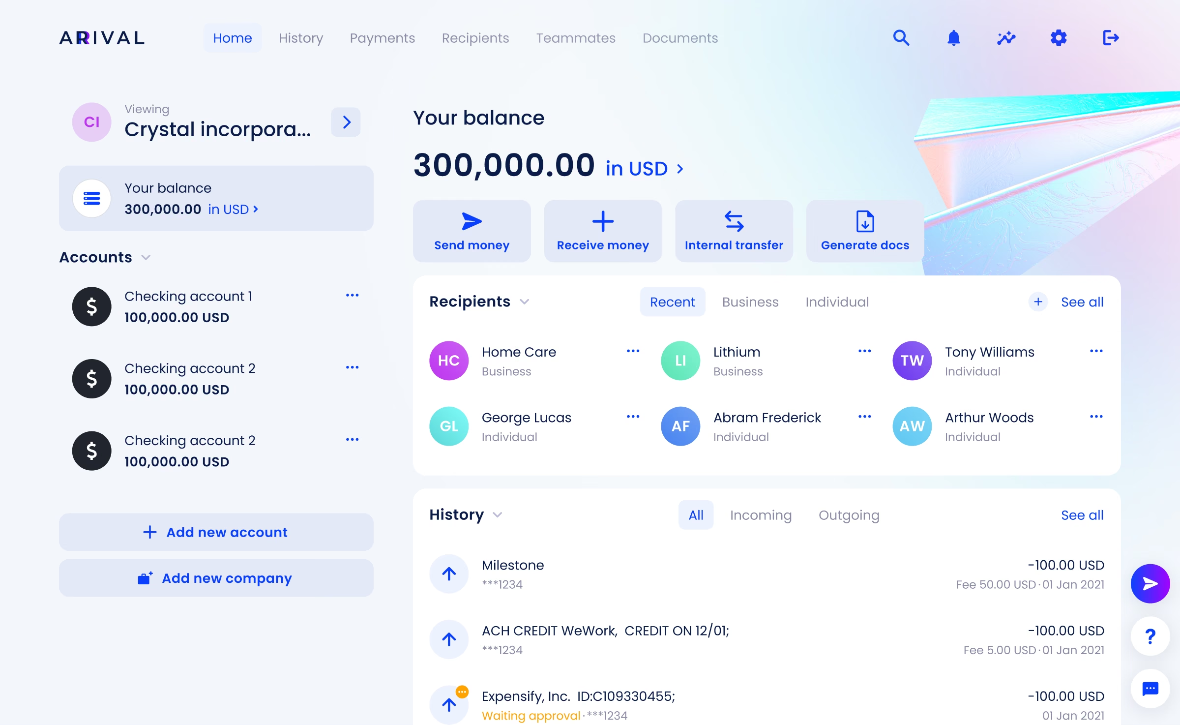
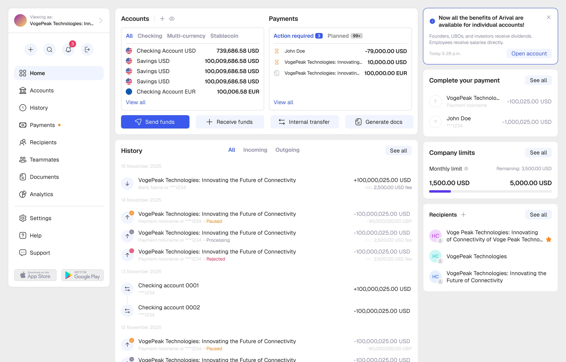
A two-column dashboard. The single-column structure was the reason widgets had to be large. Moving to two columns let medium and small widgets coexist, made room for engagement banners, and allowed two new widgets — important notifications and payments — that had no home before. The cost was rebuilding every existing widget's content model.
Accounts became a section. Accounts had been living on the dashboard because flows started there. That made the dashboard a list manager and left no room for sorting, filtering or blocked-account states. Giving accounts a dedicated section cost a click and bought an entire surface for problems that had been accumulating for years.
Navigation moved left, entity switching moved up. Sections went to a left rail with scroll, which removed the width ceiling. Switching between legal entities moved into the header, aligning with how web applications behave generally, and every entity and product got one place of its own — a "Netflix page" for choosing a company or opening a new one. The bottom-left corner, which had quietly become a dumping ground, was emptied.
The header became a launch point. A single action button starts any main flow from any section, not only money transfers. The left side of the header now holds what the plan costs the client: average balance and any unpaid fees, where they are seen every day instead of being found in settings.
What it looked like for the team
Three designers, from January to mid-February 2024, with the files handed to development on 15 February — ahead of the sprint plan. These are the weekly reports to the CTO from those weeks.
How it went
From the first concept to the white-label system, by the big reviews and acceptances.
- Concept · Oct–Dec 2023
Redesign kicked off in its own file.
Dashboard prototype presented to leadership.
- Build · Jan–Feb 2024
Redesign epic agreed with engineering.
Designs handed over on 15 Feb, ahead of plan.
- Ship · Mar 2024 – Apr 2025
New palette approved.
Web redesign shipped.
Apps tested for release.
- In use · 2025
No rebuilds, only features on top of it.
Then a client wants it configurable.
- System · 2026
Geist chosen as the new typeface.
Colour presets and the configurator.
All files on the new type and colour in two weeks.
Banking Tech Awards USA. New logo.
What we removed
Three decisions I consider more informative than anything we added.
Recipient type tabs were removed. The system had tabs for business and individual recipients plus a drafts section. In practice people wanted one sortable list and treated drafts as a junk drawer. We replaced the tabs with filters and deleted the drafts area.
The avatar upload flow was cut. It needed a rebuild anyway, but that wasn't the reason: once we looked at actual usage, the share of people who had ever used it did not justify maintaining the flow.
A third case is subtler, and I like it more.
Transaction labels — the feature that lets people categorise their spending — were barely used, so the column reserved for them sat empty in the real product while other data had nowhere to go. We didn't delete the feature. We demoted it: labels moved into the detail cards, and the width they had been holding went back to content people actually read.
All three are small, and all three come from the same instinct: decide from behaviour, not from the org chart of the UI.
What we aimed for
The main wishes for the new interface, arrived at after long rounds with stakeholders. Four workstreams carried them.
Palette and type, simplified. Fewer colours and type styles, lighter and easier to read.
UI kits rebuilt from scratch. Desktop, mobile web and native apps.
Every section redesigned. All banking sections, not a selected few.
Every flow reworked. One block-based pattern for all user flows.
The result
Flows became blocks with a preview of what comes next. Users could not estimate how long a flow would take, and recovering a value entered two steps back meant pressing browser-style back and risking the rest. The new structure shows completed steps as compact blocks, keeps key entered data visible throughout, and previews what remains. The motion between blocks and the automatic focus on the next field were part of the decision, not decoration: they keep the eye where the work is.
Design in motion
How we structured it
Four libraries share one token vocabulary: desktop, mobile web, iOS and Android. Mobile web has its own component layer rather than a shrunken desktop — a functional mobile web version is rarer than it should be in fintech, and we kept it first-class. Product files consume the libraries and never redefine them, so a change to a token reaches every surface at once.
- components in the desktop library
- 258
- variants across them
- 2,647
- libraries on one token set
- 4
- components in mobile web alone
- 370


 1 · Home and balance
 2 · Success screen after a flow
 3 · 2FA authorisation
 4 · Planned payments
Last but not least: mobile apps
The apps were the one part I deliberately handed over — and then had to provoke.
The app update was Andrey's, and most of it ran well with almost no input from me. Except the start: his first mockups read like a polish, not a redesign.
So, after agreeing it with the CTO, I drew my own version of the app — deliberately contentious in exactly the places that needed to move — and showed it as a serious proposal.
 1 · Home
 2 · Notifications hub
 3 · Profile & settings
 4 · Switch company
 5 · Main menu option
 6 · Main menu option
 7 · Actions submenu
 8 · Actions submenu
It worked. Andrey pushed back hard, and the new app grew out of that argument.
The app as it shipped, Andrey's screens:
 1 · Home
 2 · Recipients
 3 · Incoming transfer
 4 · Send money: amount
 5 · Supporting documents
 6 · Settings
 7 · Document details
 8 · Teammate limits
 9 · Statements
 10 · Select country
 11 · Custom statement
 12 · History
 13 · Teammate details
 14 · Notifications
 15 · Analytics
 16 · Success
Step two: redesign to white-label system
The 2024 work fixed the structure. It did not yet make that structure a system: the screens were right, but the rules underneath them still lived partly in habit and partly in files. Everything we wanted next — a second surface, a configurable product, a library the team could extend without me in the loop — depended on closing that gap. So the second phase was not a reaction to the first one failing. It was the half of the programme that turns a redesign into something other people can build on.
The 2026 pass was structural rather than cosmetic: a new type system applied by role — headings, body, captions and numerics each mapping to their own style — and a rebuilt component library underneath it, including a parallel library for the mobile web surface, which carries its own component layer rather than a scaled-down copy of desktop.
Who owned what
I ran the research, set the improvement zones and drew the first drafts of the main pages, then built the new UI from scratch — type, colour, base components — and took every stage through stakeholders, the CTO first. Andrey and I turned it into a library: I made new components and handed them over, he finished the states and packaged them, and he assembled the details cards for every entity. For the screen rebuild and the component swap Alexander joined: the three of us split the product into zones by importance and replacement difficulty and moved all of it in two weeks.
It shipped without pausing the release train. Two intermediate reviews and a final pass after the files had settled, specifically to catch what had drifted while the work was in flight.
The test of whether the gap actually closed is the white-label section below. The configuration was only possible because of this phase, and the bank's own current theme is one of its outputs.
Where it ended up: a configurable system the bank itself runs on
The redesign's real dividend wasn't visual. Once the product was genuinely decomposed into tokens, it became configurable — and a major client asked for exactly that, insistently. Demand came first; design had already made it feasible.
What a partner can change. Eight palettes, each a full system — backgrounds, surfaces, text and states coordinated — rather than one brand colour bolted onto a default theme. Seven are partner schemes; the eighth is ours, and I'll come back to it. Five layout configurations, each shifting colour, typography, block styling and navigation together, so the choice is a coherent product rather than a recolour. Thirty-plus type families including a dedicated Arabic set, so Arabic-speaking markets get typography that reads naturally instead of a Latin face stretched to fit. Corner radius, shadow depth, block borders, spacing density, chart types.


The configuration
One panel, applied live. Everything above sits in a single control surface, and every adjustment previews instantly against the real interface — the client sees the actual product taking their brand, not a mockup. Font licensing is visible at the point of choice, so legal clearance happens inside the flow instead of as a separate audit afterwards. Onboarding a new brand is configuration, not a project.
The panel is not where it ends. Every scheme lives on its own technical page in Figma — Cobalt, Fuchsia, Indigo, Azure, Sky, Teal, Mint, and the bank's own — and those pages are the source of truth, not a picture of it. Together with our lead front-end engineer we agreed that the build reads colours straight from them by token: a designer changes a value on the page, and the product picks it up without anyone retyping a hex code. A configurator whose output a developer has to copy by hand is a demo. One that the build reads by itself is infrastructure.
What stays fixed, and why. Flow structure, information hierarchy, required states and contrast are not configurable. A partner buys a proven banking product; the parts that make it work are not the parts they should be able to break. Drawing that line — deciding what the brand owns and what the system owns — was the actual design work.
The proof is that we run on it. Eight schemes exist and one of them is ours: the bank's own upgraded theme is a configuration of this same system, applied as the last layer of the redesign. The product in the screens above is not a reference implementation sitting next to the configurator — it is an instance of it. That is also the honest answer to whether a design system survives contact with a real product: we are the customer that would notice first.
What users told us
Worth reporting in both directions, because only one of them is useful.
Internally, people who use the product daily adapted to the large redesign within a couple of days and described the transition as painless. That is the outcome you want from a structural change: the shape moves, the habits survive.
One specific decision inside the second pass did not land. A shortened side menu — supported by most of the team, including leadership — turned out to be genuinely uncomfortable for daily users. Weeks in, they still hadn't adapted, and said so. We are reverting parts of it.
A solution can look more convincing in a demo than it behaves in daily use.
Reviewing your own work from the outside is not the same as living in it, and the people living in it are the ones to ask.
It was recognised externally. Banking Tech Awards USA 2026: Winner, Best User/Customer Experience Initiative for Business. New York, 28 May 2026.
It was recognised internally, too.
So many statuses — and every one of them beautiful. Seriously good work.
Analytics lead
Required states, disclosures and approvals were designed in from the start, not bolted on after review. That made sign-off faster, not slower.
Compliance lead
Design came to every product discussion with a structure, not a picture. The two-column dashboard settled arguments we'd been having for a year.
Product lead